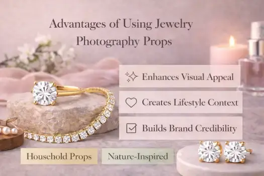
When it comes to selling jewelry online, jewelry photography props are easily one of the most important (yet overlooked) tools for turning a basic product shot into an image that actually builds trust.
Let’s be real: you can have the most stunning piece of jewelry in the world, but if your photo is flat and boring, nobody is going to hit that “buy” button.
It’s a huge frustration for new sellers—knowing your work is high-quality, but seeing it look dull or “cheap” once it hits the screen.
The truth is, a plain white background and a smartphone camera rarely tell the whole story.
When you just toss a ring on a table, you lose the sparkle, the scale, and that emotional “wow” factor that makes a customer fall in love.
Props aren’t just extra “stuff” in the frame; they do the heavy lifting for you.
They add depth, create a sense of luxury, and—most importantly—help the customer understand the size and feel of the piece without ever touching it.
Whether you are using high-end styling blocks or a simple DIY setup you found in your kitchen, jewelry photography props allow you to create that “expensive” studio look even if you’re working on a shoestring budget.
Of course, styling is just one piece of the puzzle. When you pair great props with smart lighting and a bit of professional retouching, you turn a basic photo into a high-converting visual that commands attention.
In this guide, I’m going to break down everything you need to know.
We’ll skip the gatekeeping and look at the best creative, minimalist, and DIY ideas to help your jewelry finally get the attention it deserves.
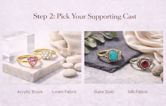
In the simplest terms, jewelry photography props are the supporting cast for your main star: the jewelry.
Think of them as the styling elements you use to prop up, display, and breathe life into a piece.
Their job is to create a balanced look, add a little depth, and make your photos look like they were taken by a pro, not just snapped on a kitchen counter.
A common mistake is thinking a prop has to be something fancy. In reality, a prop is anything in the frame that isn’t the jewelry itself.
The golden rule? It should never steal the show. Instead, a good prop acts like a guide, leading the customer’s eye straight to the sparkle, the texture, and the fine details of your design.
It’s also easy to confuse props with backgrounds, but there’s a big difference.
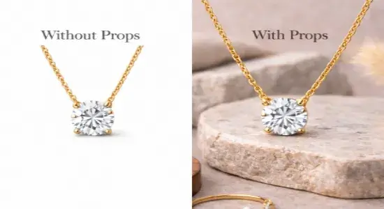
Your background is the surface or color behind everything. Props, on the other hand, are 3D elements—like an acrylic block or a piece of driftwood—that add structure and height.
For example, a plain white background is clean, but when you use an acrylic block to lift a ring up, you suddenly have shadows, depth, and a much more premium feel.
Professionals use jewelry photography props to tell a story without saying a word. Want to look high-end? Use a scrap of velvet.
Want to show off a handmade, “earthy” vibe? Use some natural river stones. These little visual cues help a buyer imagine how that jewelry fits into their own life.
Whether you’re posting on Etsy or your own Shopify store, the right props turn a “flat” product shot into a polished image that people actually trust.
Using jewelry photography props isn’t just about “decorating” a photo. It’s about psychology.
In an online shop, your customer is basically flying blind—they can’t feel the weight of the silver or see the way a diamond dances in the light.
Their entire decision to trust you happens in the split second they see your image.
If your photo looks flat or neglected, they’ll assume the jewelry is, too. Props are the bridge that connects your product to the customer’s emotions.
High-quality jewelry product photography relies on props to communicate value, scale, and craftsmanship to online buyers.
Let’s be honest: presentation is everything. When you style a necklace on a piece of soft linen or a marble slab, you’re sending a silent signal that this piece is special.
It’s the difference between a ring sitting on a kitchen counter and a ring sitting in a boutique window.
By using jewelry photography props, you’re instantly raising the “perceived value” of your work. If it looks expensive, customers are much more likely to pay what it’s actually worth.
The number one reason for jewelry returns? “It was smaller than I thought.
Without a prop for scale, a pendant can look like a tiny charm or a massive statement piece—the camera doesn’t know the difference.
But still you should use the best camera for the jewelry photography as per your budget.
Using a hand, a specific stand, or even a lifestyle prop like a perfume bottle gives the eye a reference point.
It helps the customer think, “Okay, I see exactly how that sits,” which builds the confidence they need to hit “checkout.”
Consistency is what separates a hobbyist from a professional brand.
If every photo you post uses a similar style of props—maybe you always use raw wood for a bohemian look or sleek acrylic for a modern vibe—you’re building a visual signature.
Over time, people will recognize your photos before they even see your shop name. That kind of brand recognition is how you build a loyal following.
I recently saw this in action with a creator on Etsy. Her handmade rings were beautiful, but her photos were just… “okay.” She was getting clicks, but no sales.
She started experimenting with simple jewelry photography props—specifically some textured linen and a few geometric blocks to add height.
Within just a few weeks, her shop felt like a high-end brand.
Her click-through rate jumped, and more importantly, her customers stopped asking “how big is this?” and started actually buying.
It just goes to show: you don’t need a bigger marketing budget; sometimes you just need better styling.
The Growing Pains: Common Prop Mistakes (And How to Avoid Them)
While photography jewelry props are a total game-changer, they can also be a bit of a double-edged sword for beginners.
If you’ve ever looked at your photos and thought they looked “messy” rather than “styled,” you aren’t alone.
It’s easy to accidentally let the props work against you instead of for you.
The biggest mistake I see is when a prop actually “bullies” the jewelry. If you’re using a background that’s too bright, a texture that’s too busy, or an object that’s twice the size of your ring, your jewelry is going to get lost.
Remember: the jewelry is the star; the prop is just there to hold the spotlight.
If people notice the beautiful flower in your shot before they notice the earrings, it’s time to simplify.
When you’re first starting out, it’s tempting to throw everything but the kitchen sink into the frame.
You might think three different fabrics, a candle, and some crystals will make the shot look “fancy,” but usually, it just looks cluttered.
Visual noise is the enemy of a sale. If a customer has to squint to find the product in a sea of photography jewelry props, they’re just going to keep scrolling.
Colors can be tricky. If you pick a prop that clashes with your metal or gemstones, it can actually “bleed” color onto the jewelry.
Suddenly, your crisp silver looks yellow, or your emerald looks muddy.
Not only does this look unprofessional, but it’s a recipe for unhappy customers when the piece arrives and looks nothing like the photo.
If you have a shop with twenty items and every single one is styled with a different set of photography jewelry props, your store is going to feel a bit chaotic.
Customers find comfort in consistency.
If your brand vibe jumps from “rustic wood” to “modern neon” in the same catalog, it’s hard for people to trust that you’re a professional business.
Finally, I talk to a lot of sellers who think they can’t have “pro” photos because they can’t afford a $500 prop kit.
This is a huge myth! You don’t need to spend a fortune to upgrade your look.
In fact, some of my favorite shots ever were done with a $2 piece of marble tile or a scrap of linen from a craft store.
When you’re picking out jewelry photography props, you can’t just grab whatever looks pretty.
You have to think about the metal. Gold and silver “behave” differently under lights, and the colors you put next to them can either make them look like luxury heirlooms or cheap costume jewelry.
Here is how to choose the right “stage” for your metals so they actually look their best.
Gold is all about that warm, rich glow. If you put it against something too cold or clinical, it can look out of place.
- The Best Colors: Earthy tones are your best friend here. Think deep forest greens, terracottas, or warm creams. These colors lean into the warmth of the gold and make it feel “expensive.”
- The Best Textures: Dark wood, beige linen, or even a piece of chocolate-colored slate.
- Pro-Tip: Watch out for “yellow-on-yellow.” If you put a gold ring on a bright yellow background, the metal will get lost. You want a color that complements the gold, not one that tries to be it.
Silver-toned metals are like mirrors; they pick up every color around them.
If you use a warm-toned prop (like a bright orange cloth), your silver is going to look “tarnished” or yellowed in the photo—even if it’s perfectly clean.
- The Best Colors: Cool tones are the way to go. Slate greys, icy blues, or a crisp, marble white keep the silver looking bright and “white.”
- The Best Textures: This is where jewelry photography props like acrylic blocks or smooth ceramic tiles really shine. The clean, hard surfaces match the modern, sleek vibe of silver perfectly.
- Pro-Tip: If you’re shooting on a white background and the silver is looking “invisible,” try using a piece of black cardstock just out of the frame. It will create a tiny bit of dark reflection on the edges of the metal, giving it shape and “pop.”
If you search for props online, the options can feel overwhelming. But here’s a secret: you don’t need everything.
Most photography jewelry props fall into four main “moods.” Once you understand which mood fits your brand, choosing your tools becomes a lot easier.
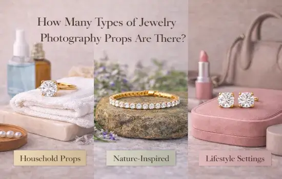
If your jewelry is handmade, bohemian, or uses raw gemstones, natural props are your best friend. They tell the customer that your pieces are authentic and “one-of-a-kind.”
- What to grab: Smooth river stones, weathered wood, dried flowers, or even a handful of sand.
- Why they work: They add a rugged, organic texture that makes silver and raw gems look incredibly high-end without looking “stiff.”
There’s a reason high-end jewelers use velvet—it screams luxury. Fabric props are perfect for bridal pieces or anything you want to feel “expensive.”
- What to grab: Scraps of silk, linen, or velvet.
- Why they work: Fabrics are great for creating “valleys” and folds that catch shadows. This adds depth to your photo and makes the metal’s shine really pop against the soft texture.
If you want that clean, “Apple-style” catalog look, you want hard surfaces. These are the go-to photography jewelry props for modern brands that want to look sleek and professional.
- What to grab: Marble tiles, acrylic blocks (to create that “floating” look), or even a piece of slate.
- Why they work: They provide clean lines and interesting reflections. They are especially great for Amazon or Shopify listings where you want the focus to be 100% on the geometry of the jewelry.
Sometimes, a customer needs to see “who” the jewelry is for. Lifestyle props help them imagine the jewelry sitting on their own nightstand or being opened as a gift.
- What to grab: An open book, a vintage perfume bottle, or a beautiful gift box.
- Why they work: These props create an emotional “click.” They turn a piece of metal into a “gift for a loved one” or a “treat for yourself.” They’re absolute gold for Instagram and social media.
The best part? You can mix and match. A ring on an acrylic block (Hard Surface) sitting on a piece of raw silk (Fabric) can create a look that is both modern and incredibly luxurious.
Don’t be afraid to experiment until you find the “voice” of your brand.
Why this version works:
- Focus on Brand Identity: It explains who should use which prop (e.g., “handmade/boho” vs. “modern/sleek”).
- Practicality: It uses phrases like “what to grab” and “why they work,” which is much more helpful for a beginner than a formal definition.
- Style Mixing: It adds an “Expert Tip” at the end about mixing categories, which shows real-world experience.
- Varied Language: It swaps “textile props” for “that soft, expensive feel” and “lifestyle elements” for “telling a story.”
Let’s be honest: in the online world, your photos are doing 100% of the selling for you.
Using photography props for jewelry isn’t just about making things look “pretty”—it’s a strategic move that directly impacts your bottom line.
Here is what actually happens when you start using props correctly:
We’ve all seen those listings that look like they were shot on a messy bedsheet with a blurry camera.
Do you buy from them? Probably not. When you use clean blocks, soft linens, or professional textures, you’re telling the customer, “I am a professional, and I care about quality.” If your photo looks premium, people naturally assume your jewelry is, too.
Marketplaces like Etsy and Amazon are loud and crowded. You are competing with thousands of other sellers for a split second of attention.
Thoughtful photography props for jewelry give your images that “editorial” look that makes people stop scrolling and actually click. More clicks always lead to more sales.
A plain product shot is just a piece of metal. But a ring sitting next to a vintage perfume bottle or a pair of earrings resting on a piece of raw silk? That’s an emotion.
Props help your customer imagine themselves wearing the piece on a date or giving it as a perfect birthday gift. Once they can imagine it in their life, they are halfway to buying it.
Consistency is the secret weapon of successful sellers.
When you use the same palette of props across all your listings, your shop starts to look like a cohesive collection rather than a random pile of items.
This “look” becomes your brand’s signature, and it makes you look much more established and trustworthy than the competition.
At the end of the day, people buy what they can clearly see and feel. When your images are elegant and realistic, it removes the “fear of the unknown.”
The customer isn’t guessing about the size or the quality anymore—they can see it. That confidence is exactly what turns a casual browser into a paying customer.
If you want to move past those “standard” product shots and create something people actually remember, you have to get a little creative.
The right creative jewelry photography props do more than just sit there—they set the mood.
They take a piece of metal and stone and turn it into a memory, a gift, or a piece of history.
Here are a few “storytelling” directions you can take:
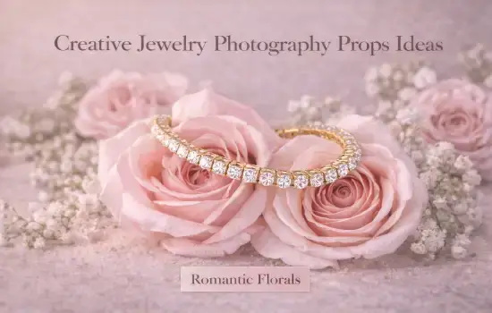
There is something incredibly romantic about antique-style photos.
If you’re selling handmade or traditional pieces, try using creative jewelry photography props like old, yellowed books, tarnished brass trays, or a scrap of vintage lace.
These items add a sense of nostalgia and “soul” to your photos, making your jewelry feel like a timeless heirloom rather than something mass-produced.
For artisan brands that are all about nature and craftsmanship, keep it earthy.
Think about using jagged raw stones, dried eucalyptus, or even a piece of weathered tree bark.
These organic textures provide a beautiful contrast to polished metal.
It tells your customer that your brand is authentic, grounded, and connected to the natural world.
If you want your jewelry to feel exclusive and expensive, you need to “dress it up.”
Use sleek marble slabs, heavy silk drapes, or a designer perfume bottle in the background.
Even a simple gold-rimmed tray can elevate a pair of earrings.
This style creates an “I’ve made it” feeling that makes your pieces feel like the perfect high-end gift.
Seasonal props are the easiest way to stay relevant on social media.
- Valentine’s Day: Use soft pink petals or minimalist heart shapes.
- The Holidays: Think about pine needles, warm fairy lights, or a hint of velvet ribbon.
- Bridal Season:Stick to crisp whites, pearls, and soft, airy fabrics. These little touches connect your jewelry to the specific moments your customers are already celebrating.
The goal isn’t to use every idea at once. It’s about picking the creative jewelry photography props that match your brand’s personality.
When you find that perfect mix, you aren’t just taking a photo of a product—you’re creating a visual experience that makes people stop scrolling and start imagining themselves wearing your work.
Minimalist jewelry photography is all about “breathing room.”
You want clean styling, soft tones, and a balanced layout that makes sure the jewelry is the undisputed star of the show.
By choosing the right top props for minimalist jewelry photography, you can create that sleek, modern look that makes a brand feel high-end and professional.
If you’re going for this style, here are the essentials you’ll want in your kit:
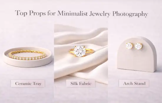
Neutral acrylic blocks are easily some of the top props for minimalist jewelry photography.
They’re perfect for gently lifting rings or earrings off the surface, which adds a sense of dimension without cluttering the background.
I always recommend a matte finish—it’s a lifesaver for reducing those harsh, annoying reflections and letting the fine details of your work actually stand out.
If a plain white background feels a bit too “cold,” matte ceramic tiles or light stone slabs are great alternatives.
They add just enough texture and depth to keep the image interesting, but they’re subtle enough that they won’t overpower the jewelry.
This is the go-to look for clean, professional eCommerce shots.
Not all minimalism has to be hard surfaces. Soft, monochrome fabrics—think linen in shades of beige, ivory, or slate gray—can bring a lot of “soul” to a photo.
These are popular top props for minimalist jewelry photography because the natural folds add warmth and a bit of flow, keeping the final image looking elegant rather than clinical.
To round out the look, simple wooden blocks or trays are fantastic for adding structure.
Their neutral tones play well with almost any metal or gemstone, helping you keep your product catalog looking balanced and cohesive.
At the end of the day, when you use these tools consistently, you’re doing more than just taking a photo.
You’re building a refined, premium brand appearance that tells your customers they can trust the quality of what you’re selling.
Let’s be honest: when you’re just starting out, the last thing you want to do is drop a few hundred dollars on “professional” styling kits.
The good news? You don’t have to. DIY jewelry photography props are often the secret weapon of top-tier sellers.
They are cheap, you can customize them to fit your brand perfectly, and you likely already have half of them in your junk drawer or kitchen.
If you’re running a home studio or a small startup, DIY jewelry photography props just make sense.
Not only do they save you a ton of money, but they also give you total creative control.
You aren’t stuck with whatever “stock” props everyone else is using on Etsy. You can paint, bend, and fold your way to a look that is 100% yours.
Plus, they’re usually lightweight and easy to tuck away when you’re done for the day.
You’d be amazed at what a little imagination can do with basic household items:
- Paper & Foam Boards: A simple sheet of white chart paper is the fastest way to get that “seamless” infinity background.
- Kitchen Tiles & Plates: Grab a spare ceramic tile or a matte dinner plate. They add a cool, polished texture that makes jewelry look like it belongs in a boutique.
- Cutting Boards: For handmade or silver pieces, the warm grain of a wooden cutting board adds an “artisan” soul to the shot.
- The “Lift” Trick: Use old books or gift boxes to raise your jewelry. Adding height creates those beautiful, soft shadows that make a photo feel 3D.
If you can’t find a stand that fits your style, just make one.
- Clay Holders: Get some air-dry clay and roll it into simple cones. They make for stunning, minimalist ring displays.
- Wire Stands: A little bit of craft wire can be bent into “invisible” hangers for necklaces and earrings.
- The Foam & Pin Trick: This is a pro secret—use a foam board and a few pins to prop your jewelry at the perfect angle. It’s the easiest way to get that “perfect” upright shot.
Don’t settle for boring backgrounds. You can paint your own chart paper to match your brand colors or drape some linen scraps to create soft, expensive-looking folds.
If you’re feeling adventurous, a quick coat of stone-texture spray paint on a piece of cardboard can look exactly like a $50 marble slab on camera.
Your Quick 5-Step DIY Setup:
- Pick your base: Start with your background and surface.
- Set the stage: Place your DIY stands or blocks.
- Position the jewelry: Get it sitting exactly where the light hits best.
- Check your shadows: Use a side light (or a window) to create depth.
- Shoot and repeat: Take a few different angles—sometimes the best shot is the one you didn’t plan!
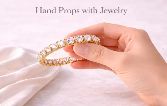
Let’s be honest: one of the hardest things about buying jewelry online is that you can’t try it on.
It takes the guesswork out of the shopping experience. When a customer sees a ring on a real hand, they stop seeing just a “product” and start seeing something they can actually imagine wearing.
Essentially, a hand prop for jewelry photography is exactly what it sounds like—using a real human hand to show off your rings, bracelets, or necklaces.
Its main job? To show the “real-life” side of your jewelry.
Hands add an instant layer of trust. They show exactly how a ring sits on a finger or how large a pendant actually is compared to a person.
It’s the most transparent way to shop; it removes that “will this actually fit me?” hesitation and gives the buyer the confidence to finally hit that “checkout” button.
- It Shows “The Fit”: You can describe a bracelet’s length all day, but seeing it on a wrist tells the story instantly.
- It Sparks the Imagination:When a buyer sees a hand in the frame, they naturally start picturing their own hand in the photo. It’s a subtle psychological trick that makes them want to own it.
- It Feels Personal:Using a hand prop for jewelry photography makes your brand feel less like a cold warehouse and more like a curated lifestyle. It’s personal, it’s real, and it builds a much stronger emotional connection.
- Rings:Don’t overthink it. A relaxed palm, a gentle grip on a coffee cup, or a natural resting pose usually looks best.
- Bracelets: Side-angle wrist shots are great for showing how a bracelet drapes and moves.
- Necklaces:Try a shot of hands gently holding the pendant or adjusting the chain. It shows the scale and the “heft” of the piece perfectly.
- Earrings:Even just a hand brushing hair back near the ear can give the perfect context for how an earring hangs.
If you’re using a hand as a prop, you have to treat it like a model.
- Moisturize! Dry skin or ashy knuckles will show up under a macro lens. A little lotion goes a long way.
- Nail Care: Keep it simple. Clean, trimmed nails with neutral polish are best.
- Keep it Distraction-Free:You want the jewelry to be the star. Bold tattoos or neon nail polish can pull the eye away from the diamond, so try to keep things as “blank canvas” as possible.
- Earrings:Even just a hand brushing hair back near the ear can give the perfect context for how an earring hangs.
- Harsh Lighting:Skin texture can look rough if your light is too direct. Go for soft, diffused light to make the hand (and the jewelry) look smooth.
- Odd Skin Tones:If your white balance is off, the skin can look blue or orange, which makes the metal look “fake.” Keep it natural.
- Crooked Jewelry:It sounds obvious, but a ring that’s slightly tilted or a bracelet that’s bunched up looks messy. Take the extra second to straighten it out!
- Earrings:Even just a hand brushing hair back near the ear can give the perfect context for how an earring hangs.
A Real-World Example: I remember an engagement ring brand that was struggling to get sales even though their rings were gorgeous.
They decided to swap their “floating” ring shots for photos using a hand prop for jewelry photography.
By showing the rings in natural, relaxed poses, they saw a massive jump in their click-through rate.
Customers spent more time on the pages because they weren’t just looking at a piece of metal anymore—they were looking at a dream they could actually see themselves living.
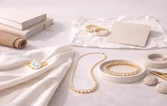
To make this sound human, we need to treat the “kit” like a photographer’s survival bag.
Instead of just listing what’s inside, a real expert explains how these tools work together to save you time and make your life easier during a long shoot.
Once you move past the “experimenting” phase, you’ll probably find yourself wanting a more streamlined workflow.
This is where a prop kit for jewelry photography becomes a total lifesaver.
Instead of hunting through your house for a random tile or a scrap of fabric every time you have a new product, a kit gives you a “go-to” collection of tools that ensure every single photo in your catalog looks like it belongs to the same brand.
Here is the humanized version:
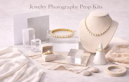
Think of a prop kit for jewelry photography as your professional styling toolbox.
It’s a curated set of blocks, stands, and surfaces designed specifically to handle the unique challenges of shooting small, shiny objects.
The goal here is consistency. When you use a dedicated kit, you aren’t just “taking pictures”—you’re controlling reflections, perfecting your angles, and making sure the “vibe” of your shop stays uniform from the first page to the last.
- Acrylic Blocks:These are essential for that clean, “floating” look. They let you lift a piece up so the light can get under it, which is the secret to making jewelry look 3D instead of flat.
- Professional Stands:Things like necklace busts or dedicated ring cones help you mimic a “wearing position” without needing a live model for every shot.
- High-Quality Neutral Fabrics:A good kit usually includes a few “hero” fabrics like high-grade linen or velvet. These add that touch of luxury that makes a piece feel gift-worthy.
- Mini Reflectors:These are the unsung heroes. Small white or silver cards help you bounce light into those tiny crevices of a ring or stone, making sure every facet sparkles.
I get asked this a lot, and the answer really depends on where you are in your business journey:
- The DIY Route:If you’re a startup or a home-based seller, a DIY kit is fantastic. It’s budget-friendly, and it teaches you the “why” behind lighting and styling. You can learn a lot by hacking together your own setup.
- The Ready-Made Professional Kit:If you’re an established brand or you’re shooting hundreds of items a week, a pre-made prop kit for jewelry photography is worth every penny. It saves you an incredible amount of time. You don’t have to “figure it out” every time—you just grab your kit and get to work, knowing the results will be identical every time.
At the end of the day, whether you build it yourself or buy it from a pro shop, having a dedicated kit is the fastest way to stop “taking photos” and start “creating a brand.”
It’s one thing to talk about “visual appeal,” but it’s another thing to see it actually change a business.
I’ve seen time and again how switching to the best props for jewelry photography can take a struggling shop and turn it into a brand people actually trust.
Here are three real-life examples of what that transformation looks like:
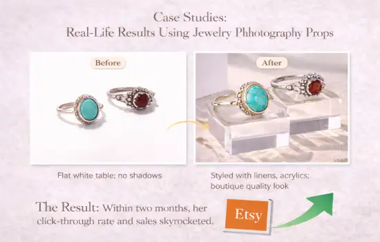
I knew a maker who was creating incredible handmade silver pieces, but her Etsy views were non-existent.
Her photos weren’t “bad,” they were just… boring. Everything was shot flat on a white table with no depth.
She decided to invest in a few of what many consider the best props for jewelry photography for beginners: some textured linen scraps, a couple of matte acrylic blocks, and clean cardstock for a seamless look.
- The Result:Suddenly, her rings had shadows and “life.” Within two months, her click-through rate skyrocketed. People finally saw her jewelry as “boutique quality” rather than just a hobby project, and her sales followed suit.
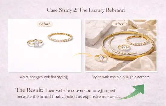
A premium brand was selling high-end gold pieces, but their website looked a bit clinical and cold.
They wanted to justify their higher price point, so they leveled up their styling game.
They started using marble slabs, heavy silk fabrics, and gold-accented trays—essentially the best props for jewelry photography for anyone chasing a luxury vibe.
- The Result:The “perceived value” of their jewelry shifted instantly. Because the photos looked like they belonged in a high-end magazine, customers were much more comfortable spending more money. Their website conversion rate jumped because the brand finally looked as expensive as it actually was.
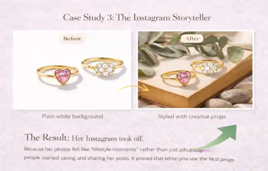
A social media photographer I follow was struggling to get engagement.
Her photos were technically perfect, but they didn’t have “soul.”
She started experimenting with creative jewelry photography props like dried eucalyptus, vintage hardcover books, and raw river stones to tell a story.
- The Result:Her Instagram took off. Because her photos felt like “lifestyle moments” rather than just ads, people started saving and sharing her posts. It proved that when you use the best props for jewelry photography to build an emotional connection, your audience grows much faster.
You can have the most beautiful jewelry photography props and the most expensive lighting in the world, but the “raw” photo coming out of your camera is rarely ready for a storefront.
It’s like a diamond fresh from the earth—it’s got potential, but it needs a final polish to really shine.
This is where jewelry photo retouching services come in to bridge the gap between “good” and “flawless.”
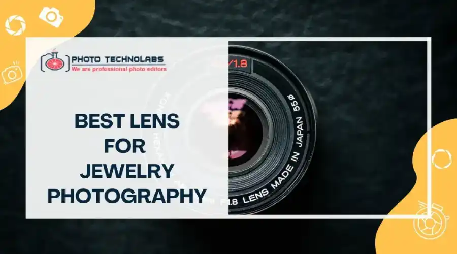
Macro lenses — especially the best lens for jewelry photography — are incredibly honest, sometimes even too honest.
They capture every tiny speck of dust, microscopic scratches on metal surfaces, and even skin imperfections that may go unnoticed during shooting.
While these flaws seem small, they can subconsciously make jewelry feel “cheap” or used. Careful post-editing removes these distractions so customers focus only on the beauty and craftsmanship of the piece, not the dust on the table.
Sometimes, a prop might cast an odd shadow or your background may have a slight wrinkle.
Smart jewelry photography background ideas help smooth uneven surfaces and balance shadows, giving your image that “floating on air” luxury feel.
This keeps the viewer’s eye focused on the jewelry, not on a smudge on an acrylic block.
If you have a catalog of 50 items, you want them all to feel like they belong to the same family.
Professional editors can match the lighting and color tones across every single shot.
This consistency is what makes your brand look like an established business rather than someone just selling things out of their garage.
At the end of the day, styling with props gets you 90% of the way there, but professional retouching is what finishes the job. It turns a “nice photo” into a high-converting visual that is ready to sell.
Getting that “perfect” shot can feel like a lot of trial and error, but if you follow a consistent routine, it becomes second nature.
When you integrate your photography props for jewelry into a clear workflow, you stop guessing and start creating images that actually sell.
Here is my go-to process for a successful shoot:
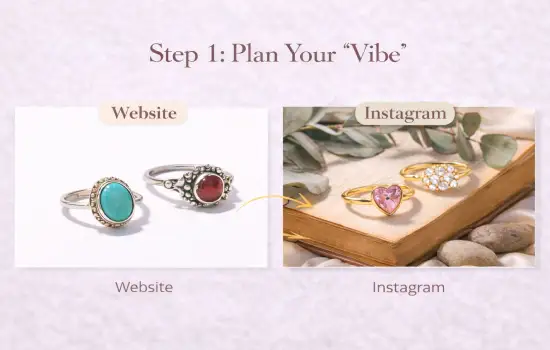
Before you even touch your camera, understand how to photograph jewelry by first deciding on the mood.
Are you going for a clean, minimalist look for your website, or a moody, creative vibe for Instagram?
Planning your concept ahead of time is the only way to pick the right photography props for jewelry. If you don’t have a plan, your brand style will end up looking messy and inconsistent.
Now, grab the props that match your vibe. Whether it’s an acrylic block for height, a piece of slate for texture, or some silk for luxury, your photography props for jewelry should support the piece, not bully it.
I always suggest laying everything out first to make sure the colors and textures don’t clash with the metal you’re shooting.
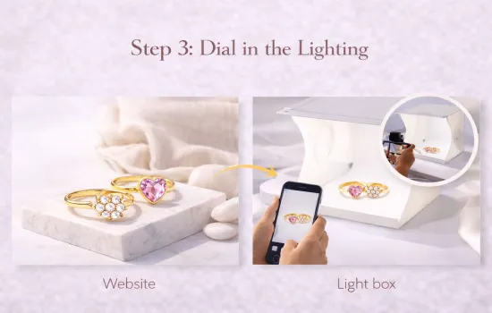
Lighting is where the magic (or the mess) happens. You want soft, diffused light to avoid those “hot spots” on shiny metal.
This is where light-colored photography props for jewelry—like white blocks or pale linens—are a secret weapon.
They act as tiny reflectors, bouncing soft light back into the shadows of your jewelry and making your gemstones look much clearer.
Using the best light box for jewelry photography helps control reflections, soften shadows, and maintain consistent lighting across your product catalog.
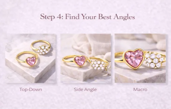
Don’t just take one photo and call it a day. Buyers want to see the “soul” of the piece.
Take a top-down shot for the layout, a side angle to show the height, and a tight macro shot for the detail.
When you have well-balanced photography props for jewelry in the frame, these different angles will all feel like they belong to the same professional story.
Even the best setup in the world will have a few tiny dust motes or a stray reflection.
Professional jewelry photo retouching is the final “must-do” step. It’s where you refine the colors, boost the sparkle, and make sure the metal looks flawless.
It’s that last 10% of effort that makes your images look like they belong on a high-end storefront.
I know that once you start looking into photography jewelry props, a lot of “what-ifs” start popping up. Here are the most common things I hear from people just starting out:
Honestly, keep it simple. If you’re a beginner, your best friends are neutral acrylic blocks, a few scraps of linen or cotton, and some basic ceramic or marble tiles from a hardware store.
These photography jewelry props are cheap, they don’t go out of style, and they make it incredibly easy to get that clean, high-end look without a struggle.
Absolutely. I’ve seen million-dollar brands use “hacked” setups for their social media.
As long as your lighting is good and your styling is intentional, nobody is going to know that your “marble surface” is actually a $2 tile from the bargain bin. It’s all about how you use them.
Definitely. The biggest mistake you can make is cluttering the frame.
I usually tell people to stick to one or two photography jewelry props per shot.
If you find yourself adding a third or fourth item, ask yourself: “Does this help the customer see the jewelry better, or am I just filling space?” If it’s just filling space, take it out.
Use them when you want to answer the “How does this look on me?” question.
Hands are great for showing scale—like how a pendant sits on a chest or how a ring looks on a finger.
They add a “human” feel to your shop that a cold, acrylic block just can’t match.
It’s a resounding yes. Think about it: customers can’t touch your jewelry.
They are buying based on a feeling. Well-styled photography jewelry props make your work look premium and trustworthy.
When people trust that what they see is high quality, they are much more likely to hit that “Buy Now” button.
At the end of the day, getting comfortable with jewelry photography props is one of the biggest moves you can make for your business.
It’s the difference between looking like a casual seller and looking like a professional brand that people can’t wait to buy from.
The most important thing to remember is that you aren’t just “decorating” a photo—you’re building a stage.
Whether you’re using a $200 professional kit or a $2 tile from the hardware store, the goal is always the same: make the jewelry the hero.
If your props help tell the story of the piece without stealing the spotlight, you’ve nailed it.
Don’t be afraid to get your hands dirty and experiment.
Try out those DIY hacks, play with the lighting on a linen scrap, or ask a friend to model their hands for a quick lifestyle shoot.
You’ll find your “vibe” by trying things out, not by overthinking them.
If you ever feel overwhelmed, just remember the “Golden Formula” for a photo that actually sells:
Smart Props + Soft Lighting + Professional Retouching = Sales
When those three things click together, you won’t just have a nice picture—you’ll have a powerful visual asset that does the selling for you.
So, grab a few items from around the house, find a nice window with some soft light, and start shooting. You’ve got this!

Ron Jonas
About Author
Hi there, I’m Ronald Jonas – A photography specialist, Blogger. Portland, Oregon Area, USA.